Most small business homepages fail in the same quiet way: they're a pile of stuff in no particular order. A logo, some text, a few photos, a paragraph the owner wrote at midnight, a contact form somewhere near the bottom. Everything's technically there — it's just not arranged to actually do anything.
Here's the better way to think about it. Your homepage is a conversation with a stranger who landed on your site and is silently asking a series of questions, in a specific order. What is this? Is it for me? Can I trust you? How do I get started? A homepage works when its sections answer those questions in the same order the visitor asks them. Get the order right and the page does its job almost by itself. Get it wrong and even great content lands in a confusing heap.
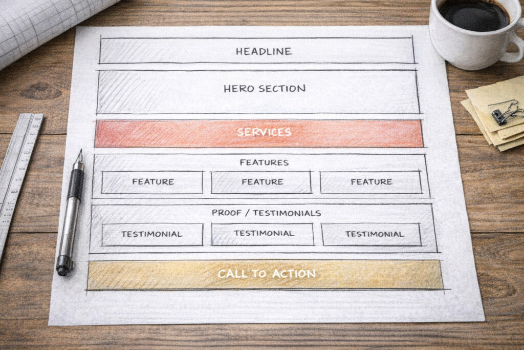
So here's what goes on a small business homepage, top to bottom, and why each piece sits where it does.
1. A clear headline that says what you do
The very first thing — the big line at the top, before anyone scrolls — has exactly one job: tell a stranger what you do and who it's for, in plain language, in about three seconds.
This is where most homepages immediately fumble. They open with something vague and clever ("Welcome!" or "Imagine the possibilities" or a fuzzy slogan) that sounds nice and says nothing. A confused visitor doesn't ask for clarification; they leave. So your headline should be almost boringly clear: what you offer, and ideally who it's for. "Bookkeeping for small Toronto businesses." "Calm, judgment-free therapy in Hamilton." "Websites for small businesses that don't have time to mess around." A stranger should be able to read it and instantly know whether they're in the right place.
Clever can come later. Clear comes first. If a visitor can't tell what you do from the top of your homepage, nothing else on the page matters, because they won't be around to read it.
2. A supporting line and one clear next step
Right under the headline, give a sentence or two of support — the slightly longer version that adds the key detail or the benefit. The headline says what; this says a bit more about how or why it's good for them.
And then, crucially: one clear call-to-action. A single, obvious button telling them what to do next — "Get a quote," "Book a consultation," "See the menu," "Contact me." One. Not five competing buttons, not a wall of options. Decide what the single most valuable action is for a new visitor and make that button impossible to miss. Every extra choice you add dilutes the one you actually want them to take.
This whole opening package — headline, support line, button — should live "above the fold," meaning visible without scrolling. It's the part the most people will ever see, so it has to carry the most weight.
3. A hero visual that fits
Alongside or behind that opening, you've got your main image — the "hero." It sets the tone before anyone reads a word, so it should actually represent your business: a real photo of your work, your space, your product, or you. Not a generic stock photo of strangers in a glass office high-fiving. People can smell stock imagery, and it quietly says "this could be anyone." A real image says "this is us."
The visual's job is mood and credibility, not decoration. It should reinforce the headline, not fight it for attention.
4. A quick overview of what you offer
Once a visitor knows what you do and that they're in the right place, the next question is "okay, what exactly do you offer?" So the next section is a short, scannable overview of your main services or products — usually three or four, each with a tiny bit of explanation.
Keep it brief here. This isn't the full services page; it's the menu, not the meal. Three or four clear options with a line each, so someone can quickly see "yes, they do the thing I need." If they want depth, they can click through to a fuller page. The homepage's job is to orient, not to exhaustively explain.
5. Proof that you're for real
Now comes the question every stranger is quietly asking: can I trust these people? This is where a lot of homepages go silent, and it's a costly silence. After you've told someone what you do, you need to show evidence you do it well — because anyone can claim anything.
This is your proof section: testimonials from real customers, logos of clients or brands you've worked with, a few words on results you've delivered, star ratings, a number that means something ("over 200 projects," "12 years in business"). Real names and real specifics beat vague praise every time — "Sarah at Riverside Bakery" lands harder than "a happy customer." Even one or two genuine testimonials placed here does enormous work, because it shifts you from "some business making claims" to "a business other people have trusted."
Trust is the hinge the whole page turns on. Put your proof where the trust question gets asked — right after you've said what you do.
6. What makes you different
Close to the proof, answer the next quiet question: why you and not the dozen others who do this? This is your chance to say what sets you apart — without trashing competitors, just clearly stating your thing. Maybe it's that you're a solo operator who actually answers the phone. Maybe it's a specialty, a guarantee, a turnaround time, a philosophy, a price model. Whatever your genuine edge is, say it plainly here.
If you can't articulate why someone should pick you over the alternative, that's worth figuring out before you build the page — because the visitor is definitely asking, whether or not you've answered.
7. A bit about the human behind it
For a small business especially, people want to know who they'd be dealing with. So a short "about" moment on the homepage — a few sentences and ideally a real photo of you — does more than you'd expect. It makes the business a person instead of a faceless entity, and for small businesses, the personal connection is often the whole reason someone chooses you over a bigger, slicker competitor.
This doesn't need to be your life story — there can be a full About page for that. Just enough, here, to put a human face on the business and let people feel like they're hiring a someone, not a something.
8. How it works
By now they're interested, so the next question is what happens if I actually do this? Uncertainty kills action — people hesitate when they don't know what they're signing up for. So a simple "how it works" section, usually three or four steps, removes that friction. "1. Get in touch. 2. We agree on a plan and price. 3. I do the work. 4. You're up and running." Whatever your version is.
Laying out the process makes working with you feel easy and predictable, which lowers the fear that stops people from taking the first step. The clearer the path looks, the more likely they are to start walking it.
9. A pricing signal (even if not full prices)
This one's optional and depends on your business, but at minimum a signal about pricing helps. Whether it's full prices, starting-at figures, packages, or just "projects typically start at X," giving people a sense of cost lets them self-qualify. The ones for whom it's a fit lean in; the ones it isn't filter themselves out before they waste your time and theirs. Total silence on price, on the other hand, makes a lot of people assume the worst and bounce. Even a rough range is better than a void.
10. An FAQ to handle the hesitations
Near the bottom, a short FAQ earns its keep by answering the objections and worries floating in a hesitant visitor's head before they have to ask. "How long does it take?" "What if I don't like it?" "Do you work with businesses like mine?" "What areas do you serve?"
Think of the questions people actually ask you over and over, and answer them right here. A good FAQ quietly removes the last few reasons someone might have not to contact you — it's objection-handling disguised as helpfulness.
11. A final, clear call-to-action
By the time someone reaches the bottom, they've either decided or they haven't — but you should never make a ready person hunt for how to act. So end with a clear, friendly closing call-to-action: a short line and an obvious button or your contact details. "Ready to start? Get in touch." The same single action you led with at the top, repeated at the bottom, so whenever someone hits "yes," the next step is right there in front of them.
12. A footer that does the quiet work
Finally, the footer — the strip at the very bottom. It's not glamorous, but it's where people instinctively look for the practical stuff: your contact info, your location and hours if relevant, links to your other pages, social links, and the housekeeping links like your privacy policy. Tidy and complete is all it needs to be. The footer is the reference desk of your site.
The thread running through all of it
Step back and you'll notice the order isn't arbitrary — it mirrors the exact sequence of questions in a stranger's head. What is this? (headline). Is it for me? (services). Can I trust you? (proof). Why you? (difference). Who are you? (about). What's it like to work with you? (process). What's it cost, what if…? (pricing, FAQ). Okay, how do I start? (call-to-action).
When your homepage answers those questions in that order, it feels effortless to read, because it's meeting the visitor exactly where their attention naturally goes. When the order's scrambled — proof buried at the bottom, no clear headline, the contact info hidden — the page feels vaguely frustrating even when people can't say why. The content might all be present; it's just not arranged as a conversation.
You don't need every one of these sections, and you don't need them to be long. A great small business homepage can be fairly short. What matters is that the pieces you do include show up in the order a real person would want them — answering each question just as they think to ask it, and always leaving the next step in easy reach.
The bottom line
A homepage isn't a brochure you decorate; it's a path you lead someone down. Say what you do, show you're for real, make working with you feel easy, and keep the next step always within reach — in that order. Do that, and a simple, clear homepage will quietly outperform a flashy, disorganized one every single day.
If you map your own homepage against this list and find a few pieces missing or out of order, that's usually a fixable afternoon, not a rebuild. And if you'd rather hand it off, that's the kind of thing I do — but mostly I just hope this helps you make yours work harder.